Real-Time Data Visualization for IoT Projects
Table of Contents
Launch your IoT product in a few weeks for MVP
Learn more
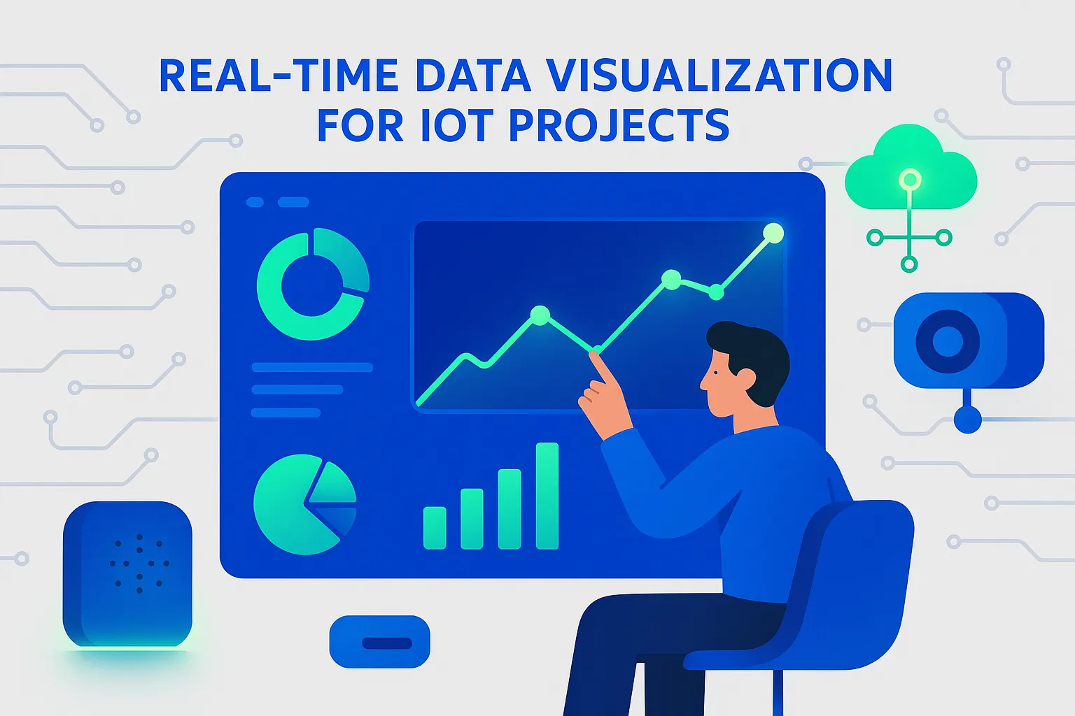
Real-Time Data Visualization for IoT: Why It Matters Now
Real time IoT data visualization turns continuous device telemetry into decisions that matter in the moment. Whether you manage a smart building, a fleet of industrial machines, or a nationwide network of energy meters, the ability to see, understand, and act on live data separates proactive operations from reactive firefighting.
Why now. The volume, velocity, and variety of IoT data have exploded. Sensors publish readings multiple times per second; edge gateways summarize workloads; and cloud analytics enrich streams with predictions. Without a clear visual layer, teams drown in data. With a well-designed IoT analytics dashboard, they detect anomalies, forecast failures, and optimize performance, in real time.
According to an overview of IoT visualization concepts, real-time dashboards help identify patterns, spot outliers, and enable faster decisions that improve outcomes and reduce costs. See the primer on IoT visualization at geeksforgeeks.org for foundational context.
What changes in practice.
- From batch reports to live IoT monitoring tools with second-level updates and alerting.
- From siloed charts to unified, multi-signal visualizations that correlate sensors, device states, geolocation, and maintenance events.
- From retrospective KPIs to streaming models that forecast and prescribe actions.
Common outcomes.
- Reduced downtime via early anomaly detection and guided responses.
- Better asset utilization through continuous performance visibility.
- Higher safety and compliance with live thresholding and audit trails.
If you are starting an IoT initiative, pair your visualization plan with your device, app, and data strategy. For mobile-facing journeys, see How to create a cross-platform IoT mobile app at geekpoint.in. For industrial scenarios, review Industrial IoT remote monitoring patterns at geekpoint.in.
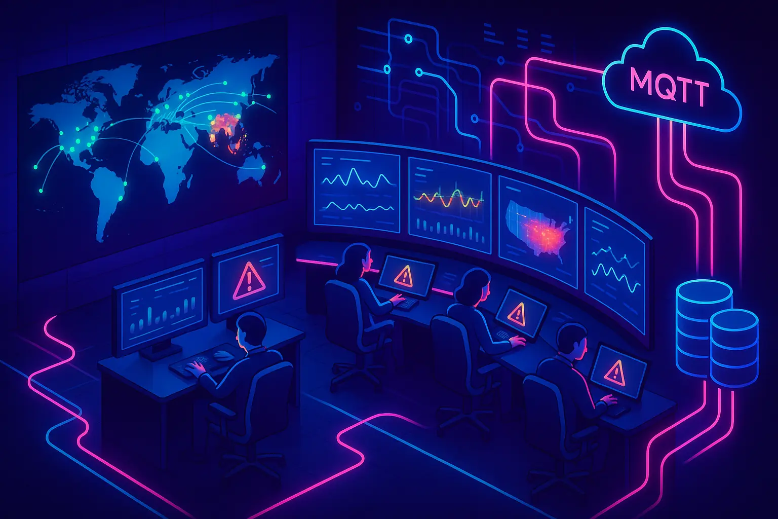
The Streaming Architecture Behind Real-Time IoT Dashboards
A robust architecture turns raw telemetry into live visuals and actions. At a high level:
1) Device and edge layer
- Sensors publish via MQTT, CoAP, or HTTPS. Gateways aggregate, filter, and enrich data at the edge to minimize bandwidth and latency.
- Edge computing can perform feature extraction and first-pass anomaly detection before sending summaries upstream.
2) Ingestion and buffering
- Message brokers or streaming platforms, such as MQTT brokers, Apache Kafka, or managed services like Amazon Kinesis, absorb spikes and standardize event formats.
3) Processing and analytics
- Real-time stream processors compute rolling aggregates, joins, and predictions. They also label events for alerting.
4) Storage
- A timeseries database for IoT workloads captures metrics with high write throughput and compresses them efficiently for quick queries.
- A warm cache (for example, Redis) serves current windows for sub-second dashboards.
5) Visualization and actions
- Dashboards render KPIs, trends, and maps; alerting systems route notifications by severity; digital twin views mirror the state of assets in context.
A reference flow might look like this:
Devices -> MQTT/Kafka -> Stream Processing (aggregations, ML) -> TSDB + Cache -> API -> Dashboard & AlertsBest practices
- Standardize event schemas; keep telemetry payloads lean.
- Plan for backpressure and retries from the device to the cloud.
- Separate hot (recent) from cold (historical) data to control cost and latency.
- Use edge inference for latency-critical detections.
If you are building remote monitoring from scratch, see Industrial IoT: building remote monitoring systems at geekpoint.in for an end-to-end guide that complements your visualization plan.
Choosing a Timeseries Database for IoT Workloads
Your choice of timeseries database for IoT affects ingest throughput, compression efficiency, query speed, and data lifecycle costs. The right fit depends on your write rates, cardinality, retention, and analytical patterns.
Decision factors
- Write rate and cardinality: How many metrics per device and how many devices at peak. High-cardinality tags, such as per-sensor IDs, can strain indexes.
- Query patterns: Single-point lookups, rolling windows, downsampled trends, or multi-tenant analytics.
- Cost and operations: Managed vs self-hosted, storage tiers, retention policies, and compaction.
- Ecosystem: Connectors for brokers and visualization tools; SQL vs custom query languages.
Popular options
| Engine | Strengths | Considerations | Typical fit |
|---|---|---|---|
| InfluxDB | High ingest, native TS functions, mature ecosystem | Tuning retention and cardinality is key | Device metrics, monitoring, downsampling |
| TimescaleDB (PostgreSQL) | SQL, joins, relational + TS hybrid | Requires sizing for heavy ingest | Unified app + analytics, familiar SQL |
| Amazon Timestream | Serverless, auto-scaling storage tiers | Vendor lock-in, cost modeling | AWS-centric pipelines |
| QuestDB | SQL and very fast ingestion | Schema planning matters | Low-latency OLAP on streams |
Lifecycle strategy
- Hot retention: 7 to 30 days in the primary TSDB for instant queries.
- Warm archive: Parquet files in object storage for weekly or monthly analysis.
- Rollups: Downsampled series saved alongside raw data for high-level dashboards.
For a deeper selection process, read Choosing the right database for IoT applications at geekpoint.in. Pair this with your target visual workloads: if you will drive heavy multi-signal comparisons and drilldowns inside an IoT analytics dashboard, confirm the TSDB supports fast group-by, window functions, and tag-based filters. If your team leans on managed ecosystems, a fully managed cloud TSDB with built-in lifecycle policies may cut operational overhead.
Tip: Prototype with a representative subset of devices and realistic write bursts. Measure ingest latency, query latency, and compression for your specific schemas before you commit.
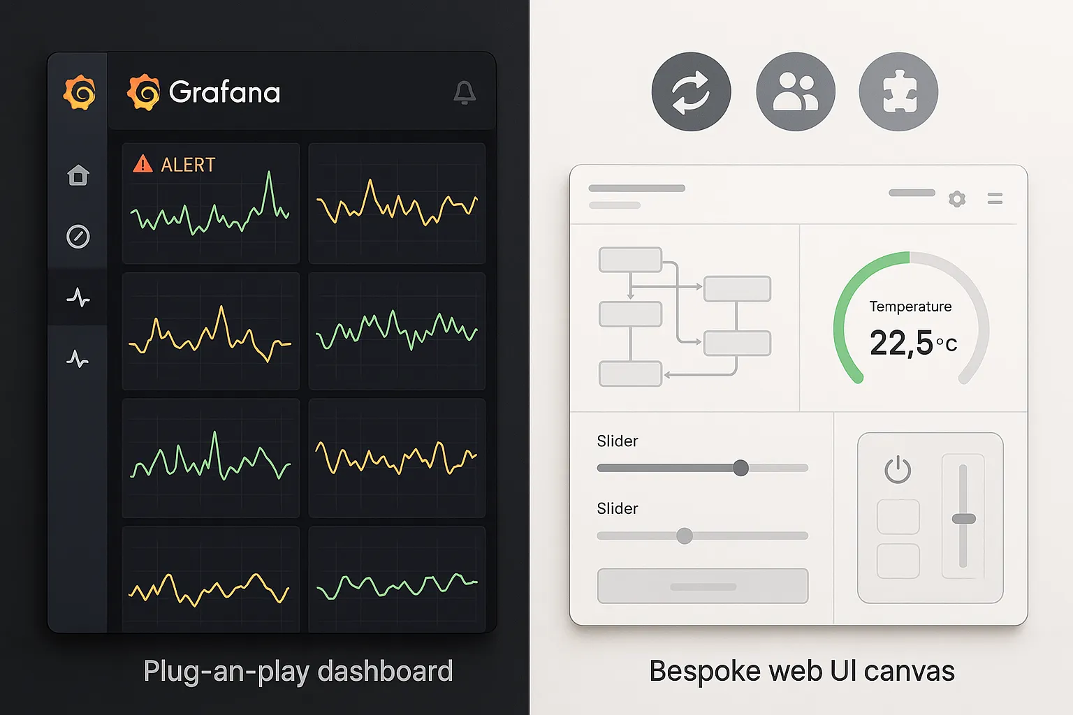
Grafana vs Custom Dashboard: Picking the Right Path
Teams often face a pivotal choice: adopt a best-in-class visualization platform like Grafana or build a custom dashboard tailored to your domain. The grafana vs custom dashboard decision hinges on speed, flexibility, and total cost of ownership.
Quick context
- Grafana offers instant connectivity to popular TSDBs and brokers, templating, alerting, and rich plugins. It accelerates time to value.
- Custom dashboards let you express unique UX, embed domain logic, and tightly integrate workflows across apps, but require more engineering.
Comparison
| Dimension | Grafana | Custom dashboard |
|---|---|---|
| Time to first value | Hours to days | Weeks to months |
| Integrations | Dozens of data sources, plugins | You build or adopt SDKs |
| Custom UX & workflows | Moderate via panels and plugins | Unlimited, but costly |
| Alerting & rules | Built-in, mature | You design and maintain |
| Multi-tenancy | Supported via orgs, RBAC | Must be designed |
| TCO | Lower initially | Higher build and maintenance |
Complementary platforms
- ThingsBoard: Open-source IoT platform with dashboards and SCADA-style widgets; see thingsboard.io.
- Exosite ExoSense: A managed solution for real-time operational dashboards; see exosite.com.
- Hopara: No-code interface with advanced visualization, digital twins, and security features; see hopara.io.
Decision heuristics
- If your primary need is rapid, standardized visuals across many data sources, start with Grafana or a managed platform.
- If your use case requires a highly specialized IoT analytics dashboard, embedded workflows, or client-facing branding, invest in a custom build. You can still source a charting engine and reuse open-source components for speed.
Further reading: Top 10 IoT platforms to use in 2025 at geekpoint.in to understand platform trade-offs beyond visualization.
A hybrid approach is common: start with Grafana for internal operations, then graduate to a custom app for customer-facing experiences once requirements stabilize.
Building an IoT Analytics Dashboard: A Practical Guide
You can assemble a production-grade IoT analytics dashboard with open-source tools and a modest stack. Here is a pragmatic path from stream to screen.
Open-source foundation
- Ingestion: MQTT or Kafka for stream transport.
- Processing: Stream processors for aggregations and thresholding.
- Storage: A timeseries database for IoT (InfluxDB, TimescaleDB, or QuestDB).
- Visualization: Shiny and Plotly in R, or React plus Plotly/Chart.js in JavaScript.
Hands-on example
- Explore this open-source prototype that demonstrates a Real-Time IoT Data Visualization Dashboard using R Shiny and Plotly: github.com.
Suggested workflow 1) Define your KPIs and alert thresholds first. Avoid building charts without decisions attached to them. 2) Create a minimal data contract for device messages and edge aggregations. 3) Ingest into a broker and write to your TSDB with retention policies and rollups. 4) Build the dashboard skeleton: navigation, device list, KPI header bar, trend panes, and a live event feed. 5) Add filters for site, asset, and time window. Implement drilldowns to device-level trends and logs. 6) Wire alert rules, severity tagging, and notification channels.
Snippet of a stream-to-chart loop (pseudocode)
while event := stream.read():
    upsert_tsdb(event.device_id, event.ts, event.metrics)
    update_cache(event.device_id, event.metrics)
    if rules.evaluate(event):
        alerts.notify(event)
Helpful internal resources
- How to build an IoT dashboard at geekpoint.in
- Smart home automation app development patterns at geekpoint.in
The outcome is a live IoT monitoring tool providing second-by-second visibility that operators trust.
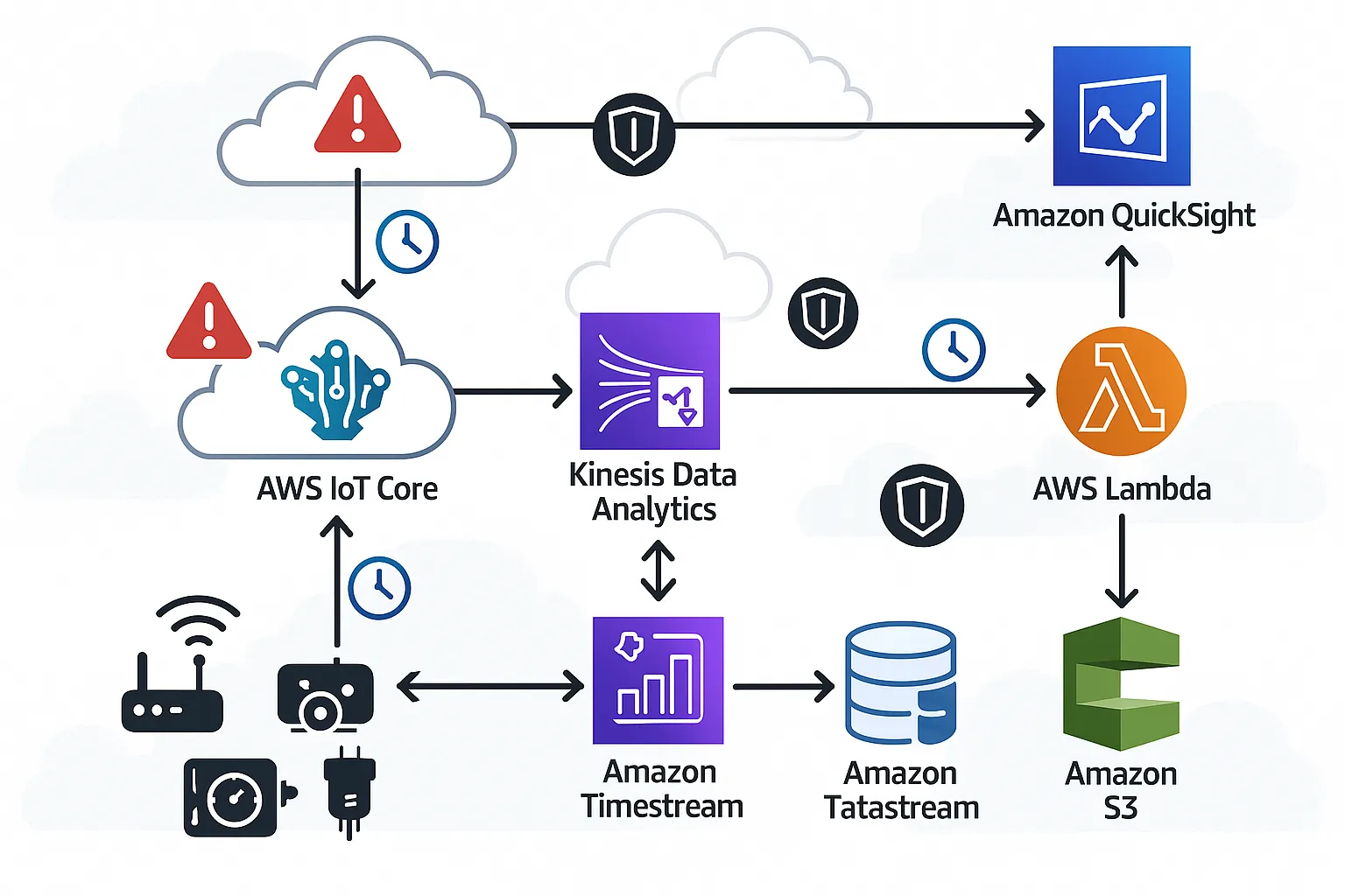
Cloud-Native Pipelines with Kinesis and QuickSight
If you are on AWS, a managed stack with Kinesis and QuickSight offers a fast route from ingestion to insight without heavy infrastructure management.
Reference flow 1) Devices publish to AWS IoT Core or directly to Kinesis Data Streams. 2) Kinesis Data Analytics or AWS Lambda performs real-time transformations, windowed aggregations, joins with device metadata, and anomaly scoring. 3) Results flow into a timeseries store and a queryable analytics store. For visualization, QuickSight can connect to these stores as a dataset. 4) QuickSight dashboards render KPIs and trends. You can embed them into portals or apps, and attach alerting via downstream services.
Step-by-step guide
- AWS published a walkthrough on building a visualization and monitoring dashboard for IoT data with Kinesis Analytics and QuickSight: aws.amazon.com.
- Consider Amazon Timestream for write-heavy metrics and efficient queries, and Amazon S3 with Parquet for long-term archival and batch analytics.
Operational notes
- Model backpressure: spikes in sensor chatter happen during restarts or network recovery.
- Use partition keys that even out shards and downstream worker load.
- Implement data quality monitors at the stream stage to catch nulls, out-of-range values, and sensor drift.
- Attach fine-grained IAM policies so tenants and roles only see authorized data.
This architecture can power both internal Grafana boards and embedded custom visuals. It also supports supervised learning workflows by exporting labeled windows to feature stores and training pipelines.
If you are balancing cloud and edge, keep a minimal local view for critical safety actions and a richer cloud dashboard for aggregated analysis.
Live IoT Monitoring Tools, Alerting, and SLOs
Real-time dashboards must trigger action, not just display charts. Define clear service level objectives and alert routes so your live IoT monitoring tools drive timely interventions.
Key concepts
- Latency budgets: Specify acceptable end-to-end delay from sensor to screen, for example less than 5 seconds p95. Instrument and track this as a first-class metric.
- Alert thresholds: Pair static thresholds with dynamic baselines. Use rolling z-scores or seasonal decomposition to adapt to cyclical patterns.
- Multi-signal correlation: Alerts should include context such as neighboring sensors, device firmware version, and maintenance history.
- Triage queues: Visualize incident queues directly in the IoT analytics dashboard with severity tags and playbook links.
Alert design checklist
- Severity levels with clear escalation policies.
- Actionable messages that state the what, where, and recommended next steps.
- Deduplication and flapping control to avoid alert fatigue.
- Post-incident annotations stamped onto charts for shared learning.
Example p95 latency and alert SLOs
- Stream ingest p95 under 1 second.
- Processing p95 under 2 seconds.
- Dashboard query p95 under 2 seconds.
- Critical alert delivery under 10 seconds.
Implementation tips
- Use TSDB continuous queries to compute rollups and baseline bands.
- Store anomaly labels in a side table and surface them as event overlays in charts.
- Integrate on-call routing via email, chat, and ticketing tools.
As your system matures, promote key visualizations to large-screen operations centers and provide lightweight mobile views for field techs. For mobile delivery patterns in IoT, see the cross-platform app guide at geekpoint.in.
Scaling Visualization for Massive IoT Fleets
At scale, the challenge shifts from showing data to making data navigable. When you visualize millions of time series or render large spatial datasets, you need strategies that preserve interactivity.
Techniques that work
- Downsampling and rollups: Compute min, max, mean, and percentile summaries at multiple granularities, and auto-select the right series based on zoom.
- Windowed queries: Restrict queries to the visible time range; cache recent windows in memory.
- Incremental rendering: Use WebGL to render dense plots and heatmaps; progressively reveal details on hover or zoom.
- Server-side pagination for device lists, tag search, and logs.
Spatial data at scale
- Large-scale spatial vector data is notoriously heavy. Display-driven visualization models and tiling strategies can improve rendering speed and fidelity. See research on interactive techniques here: arxiv.org.
- Use vector tiles and quadtrees for geospatial drilldown. Precompute clusters for popular zoom levels.
Operational patterns
- Do capacity testing with realistic fleet sizes and event bursts.
- Bind per-tenant data to specific shards or partitions to improve locality.
- Log dashboard query times as first-class metrics and surface them to operators.
Performance guardrails
- Keep panels to a purposeful set per page; avoid unbounded queries.
- Prefer push updates for hot widgets and pull for colder contexts.
- Use CDNs for static assets and SSR or hydration strategies for fast initial load.
As your fleet grows, plan for cost-aware retention tiers and scheduled rollups, and revisit the balance between hot, warm, and cold queries based on usage analytics.
Security, Privacy, and Compliance in IoT Visualization
Visualizing sensitive telemetry requires a security-first posture. Apply end-to-end controls from device identity through dashboard access, and record a thorough audit trail.
Core controls
- Encryption in transit and at rest for all telemetry and metadata.
- Strong identity for devices, users, and services with certificate rotation and short-lived tokens.
- Granular role-based access control and row-level security for multi-tenant dashboards.
- Signed dashboards and configurable data retention by policy.
Auditability and governance
- Track who viewed which panels and exported which datasets.
- Attach data lineage to visualizations, indicating upstream transforms and models.
Platform features to look for
- No-code or low-code platforms like Hopara emphasize end-to-end encryption, access controls, and audit trails; see hopara.io.
- If you integrate enterprise identity providers, ensure SSO, SCIM provisioning, and policy sync across tools.
Internal resource: IoT Security Best Practices for 2025 at geekpoint.in covers device, network, and cloud hardening. Pair those measures with privacy controls for PII and regulations like GDPR and HIPAA, where applicable.
Security UX matters too. Display access scopes and data provenance in the UI so operators understand what they are allowed to see and why. Give teams a safe, governed way to export data snapshots and annotate incidents without leaking sensitive content.
Designing for Action: UX Patterns, Interactivity, and Digital Twins
Great UX turns real time IoT data visualization into action. Instead of static charts, prioritize interaction patterns that accelerate diagnosis and decision-making.
Interaction patterns
- Faceted filters and cross-highlighting: Select by site, asset class, firmware version, or alert type; other panels update instantly.
- Linked time brushing: Drag on a time range in one panel to update all others.
- Event overlays: Annotate incidents, maintenance, and firmware updates directly on trends.
- Contextual drilldowns: Move from fleet to site to device to sensor with breadcrumbs and back buttons.
Digital twins and 3D
- Digital twins mirror the state of physical assets. Show structure, status, and key metrics in place.
- Use 3D or schematic views sparingly for high-value contexts, such as complex machines or facilities.
Future-facing experiences
- AR and VR offer immersive exploration of assets and environments, a trend highlighted by advanced visualization providers like Hopara; see hopara.io.
- Mobile-first interactions ensure field techs get concise, actionable views. Start with the essentials and provide deep links to web dashboards.
Design principles
- Purpose over ornament: Every panel earns its space by helping a task.
- Progressive disclosure: Start with KPIs, reveal detail on demand.
- Rapid feedback: Sub-second UI updates when possible.
If you plan to distribute dashboards externally or embed them in apps, consider a platform baseline first, then layer custom UX for your signature experiences. For mobile delivery and cross-platform patterns, see geekpoint.in.
Case Studies, ROI, and a Roadmap to Production
Case studies show the practical payoffs of real-time visualization in IoT. For example, Exosite highlights how companies such as CiDRA Concrete Systems leveraged connected solutions to surface real-time data on core process parameters, reducing waste and boosting competitiveness. Explore examples at exosite.com.
Common ROI drivers
- Downtime reduction through earlier anomaly detection and guided responses.
- Energy savings via optimization in HVAC, lighting, and industrial processes.
- Lower truck rolls with remote triage and targeted dispatch.
- Better quality control with inline, real-time SPC and alerts.
A pragmatic roadmap 1) Discovery: Define critical use cases, KPIs, SLOs, and data contracts. 2) Pilot: Connect a representative subset of devices, deploy a minimal IoT analytics dashboard, and measure latency and signal quality. 3) Scale: Add multi-tenancy, RBAC, and rollups; harden alerting and incident workflows. 4) Optimize: Tune cost and performance with retention tiers, caches, and query plans. 5) Extend: Embed dashboards in portals, integrate ticketing, and offer customer views.
Tooling checklist
- Timeseries database for IoT with lifecycle policies.
- Live IoT monitoring tools for alerting and auto-remediation.
- Platform decision documented for grafana vs custom dashboard trade-offs.
Internal resources to accelerate delivery
- How to build an IoT dashboard: geekpoint.in
- Choosing the right database for IoT: geekpoint.in
- Industrial IoT remote monitoring systems: geekpoint.in
- IoT app development cost: geekpoint.in
Close with a plan. Pick one high-impact, high-observability process, wire up the stream, and put a live dashboard in front of the operators who own the outcome. Iterate weekly, measure ROI, and scale what works.
Looking for an IoT app development partner?
Are you looking for a reliable partner to help you build a stunning IoT companion app? You're in the right place.
We have 6+ years of experience building a variety of IoT apps, from healthcare to HVAC. So, if you go with us, you'll be in safe hands.
If you want to learn more, feel free to reach out and our team will be happy to set up a call to discuss your needs in more detail.
Get in touch

